What I love (and hate) about Craft
Note taking apps are like task apps, there’s a million of them, and every individual has very strong personal opinions about them.
I’ve tried a never ending list of apps; Evernote, Notejoy, Bear, Notion, Apple Notes, Nebo, Agenda, Ulysses (which I use for writing blog posts). And none of them really fit the bill for my note taking app uses, except Craft.
The way I use craft is part PKIM, part note taking app, part project tracker. Below are specific features I love about Craft:
Native apps
I don’t like using web apps for my daily tools. If I am using something dozens of times a day, I want the speed and reliability of a native iOS app. Craft delivers on that with blazing fast iPhone, iPad, and MacOS apps.
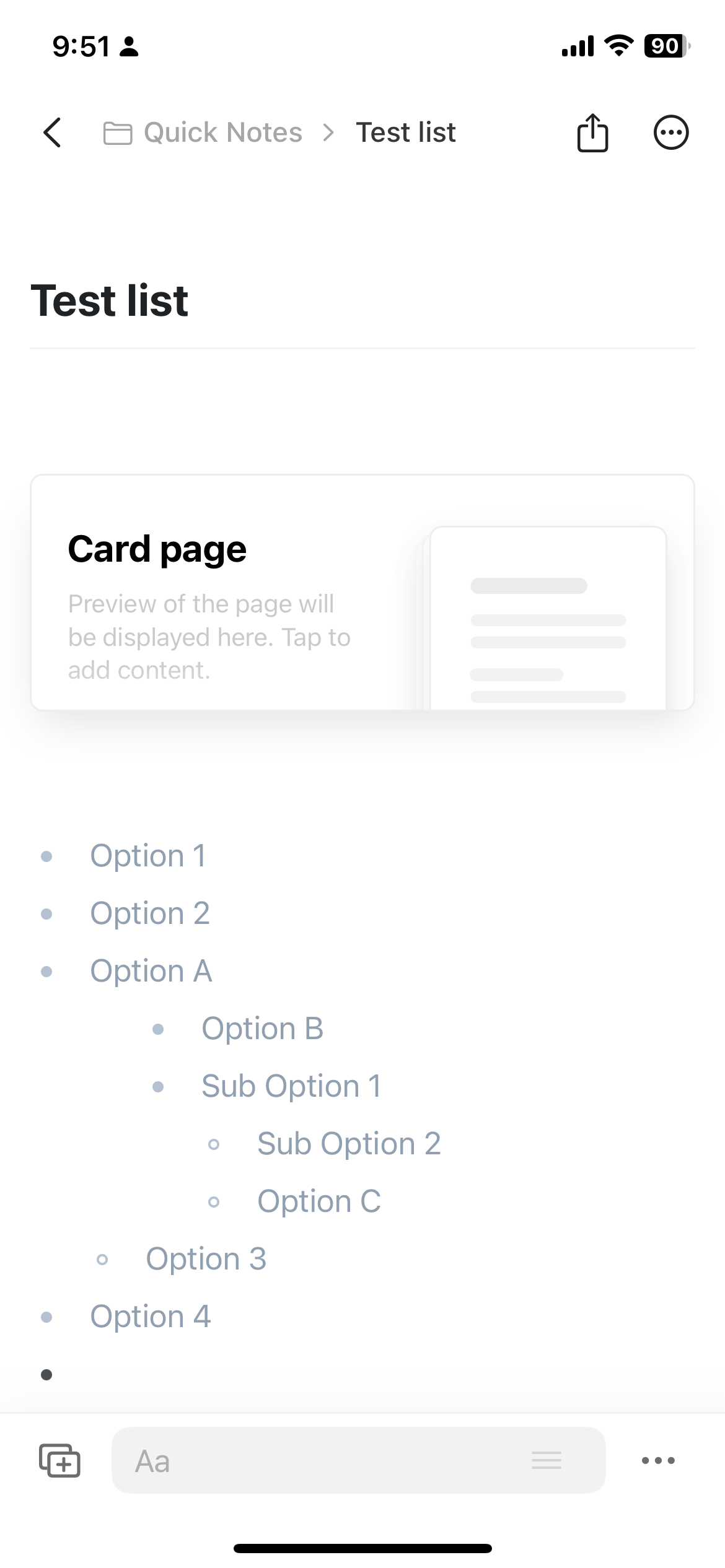
Structure Lists
I would go as far as to say that I almost never create a note that doesn’t contain some sort of structure listed, like bullet points. Maybe it just suits my way of thinking. The critical feature for lists is being able to indent and outdent quickly on all devices.
For whatever reason, many mobile note taking apps have a hard time coming up with the UI to let you indent and outdent on an iPhone or iPad keyboard. Either they don’t allow you to do it at all, which is a deal breaker, or they make it slow to access. If I’m trying to take notes quickly to fully capture my ideas… I need the process to be lightning fast and Craft does it perfectly, you simply swipe left to outdent and swipe right to indent.
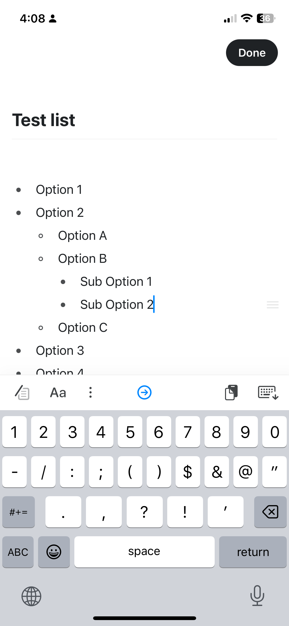
I know it sounds stupid, but this was probably the primary feature that brought me over to Craft when it first launched. It’s basic, but it’s a huge quality of life improvement.
Image formatting
A lot of my note taking consists of organizing photos and screenshots. For any project I do, there is information I want to quickly capture, organize, and retrieve later, so image formatting is critical for my use case.
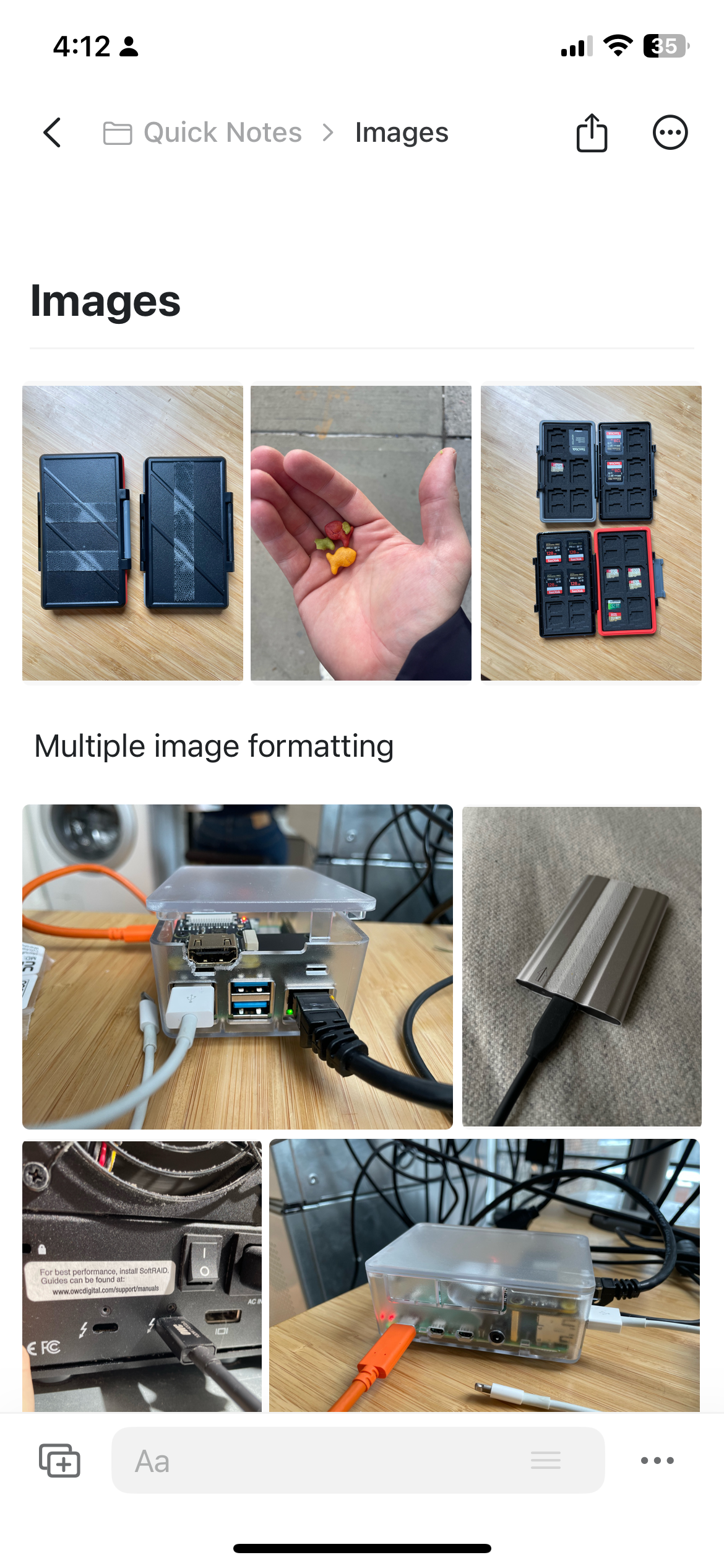
Craft does this better than any other app I’ve seen, including notion. Craft lets me put images in easily, but then as I add more images it auto-formats the images in predictable and practical ways into a mini gallery. On top of all that, the easy indenting and outdenting that works with lists up above, also work with images. Between these two features, it makes Craft the fastest and best option for storing visual information on iOS and iPad (including apple’s own Notes app).
Deep linking
The next critical feature for me is deep linking. This is a link that opens up a specific note on iOS. The reason I rely on this so heavily is that my todo app, Things 3, doesn’t have any kind of rich text note features or attachments (their dev team is notoriously slow and against feature creep). To get around this , I use deep links to link a Things todo to a Craft note, and then back to that Things todo.
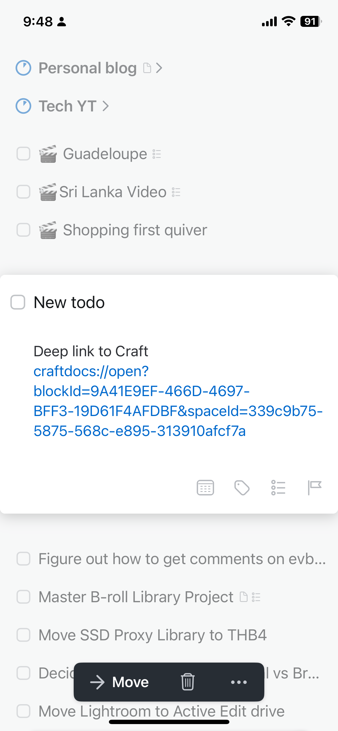
I love that the functionality exists, I hate that it's buried in the UI so deep. To get to it you need to go to “Share” >> “Export As” >> “Advanced” >> “Copy Deep Link”… which is just a ton of steps for something I use so frequently.
Slash Command
I love apps that use a pop-up command line. In fact, I think it's one of the best productivity improvements for power users in the last 10 years, and it's great that Craft uses this same UI.
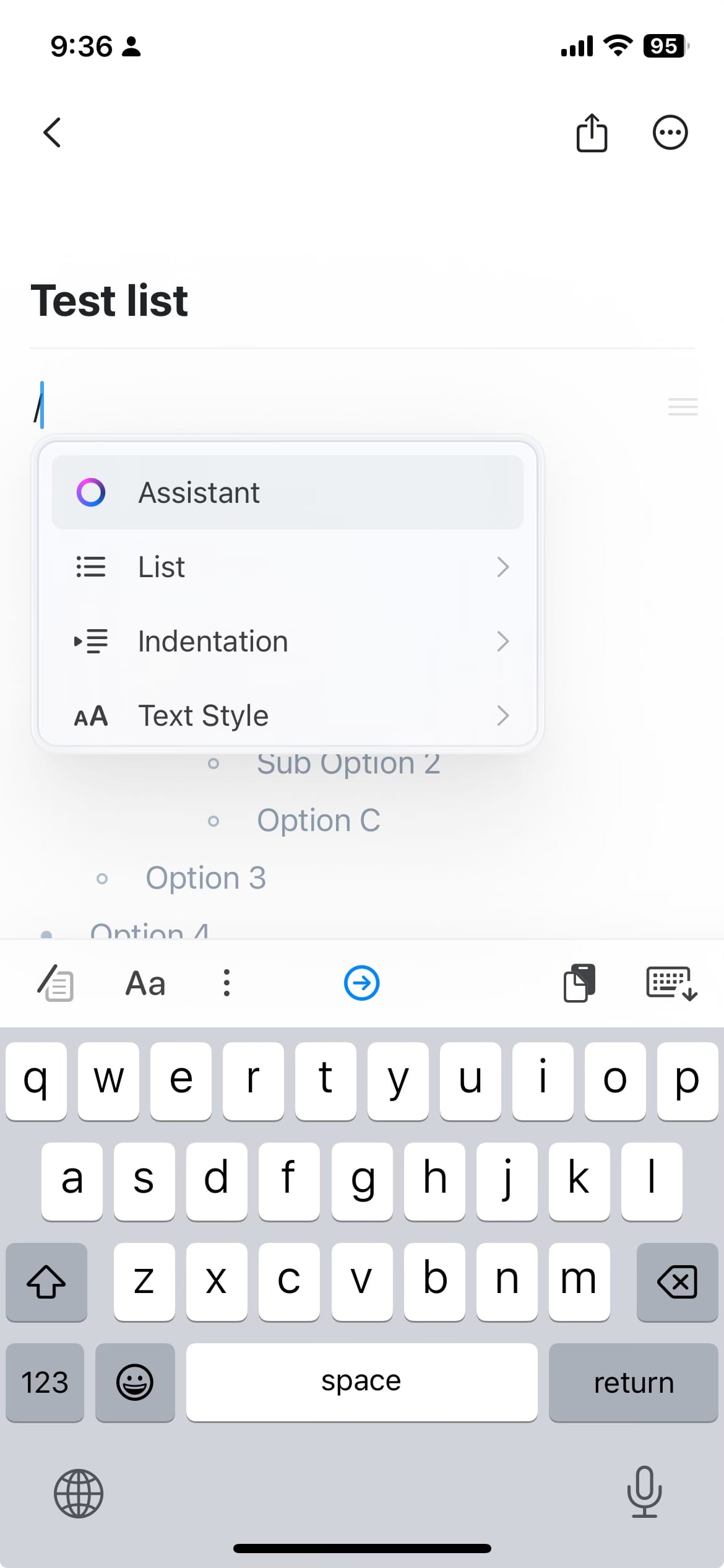
I can hit the “/“ button on a keyboard, or the button on the iOS app and I get quick access to inserting all of the different types of content that I might insert. The features I use most are tables and content toggles.
Where the app struggles
So Craft is amazing, but it’s not perfect. There are random features that feel unnecessary and complicated. One such feature is blocks. Content on a page or broken into blocks and it allows you to move them around, I’ve never used this feature and always found it annoying, it gets in the way as I try to create content. One such annoyance is that I want to be able to change the color of text, and I want to do it like any other text editor would, by selecting that text and changing the color. In crafting you can only do this by block, ie the entire line or paragraph. Another annoyance is sometimes I try to select a section of text, and craft selects the blocks rather than the selection I have in mind. These are basic things, and Craft does this worse than basically every other text editor.
Now for my one major point of friction, the lack of a Kanban type layout. I don’t need a full kanban task editor, I’m not trying to recreate Trello. What I want is the ability to build a workflow that helps me organize the content that I’m writing. This could be scripts for YouTube videos or these blog posts. I want to have columns for ideas, writing, editing, finalizing, published, etc. Ultimately for Craft to be more powerful than just a basic text editor, I need some ability to structure things in a page. The reason kanban is so powerful is that if you just do your lists vertically it becomes difficult to manage, it's just one really long page. Having a horizontal series of columns is a a much more practical UI.
Last, the creators of Craft, while they got a lot of things right at the beginning, have not added many useful things since I started using the app. It’s not clear to me that they know who they’re building the app for, and the direction it’s moving in is quite confusing. For example, the latest release makes changes that completely baffle me.
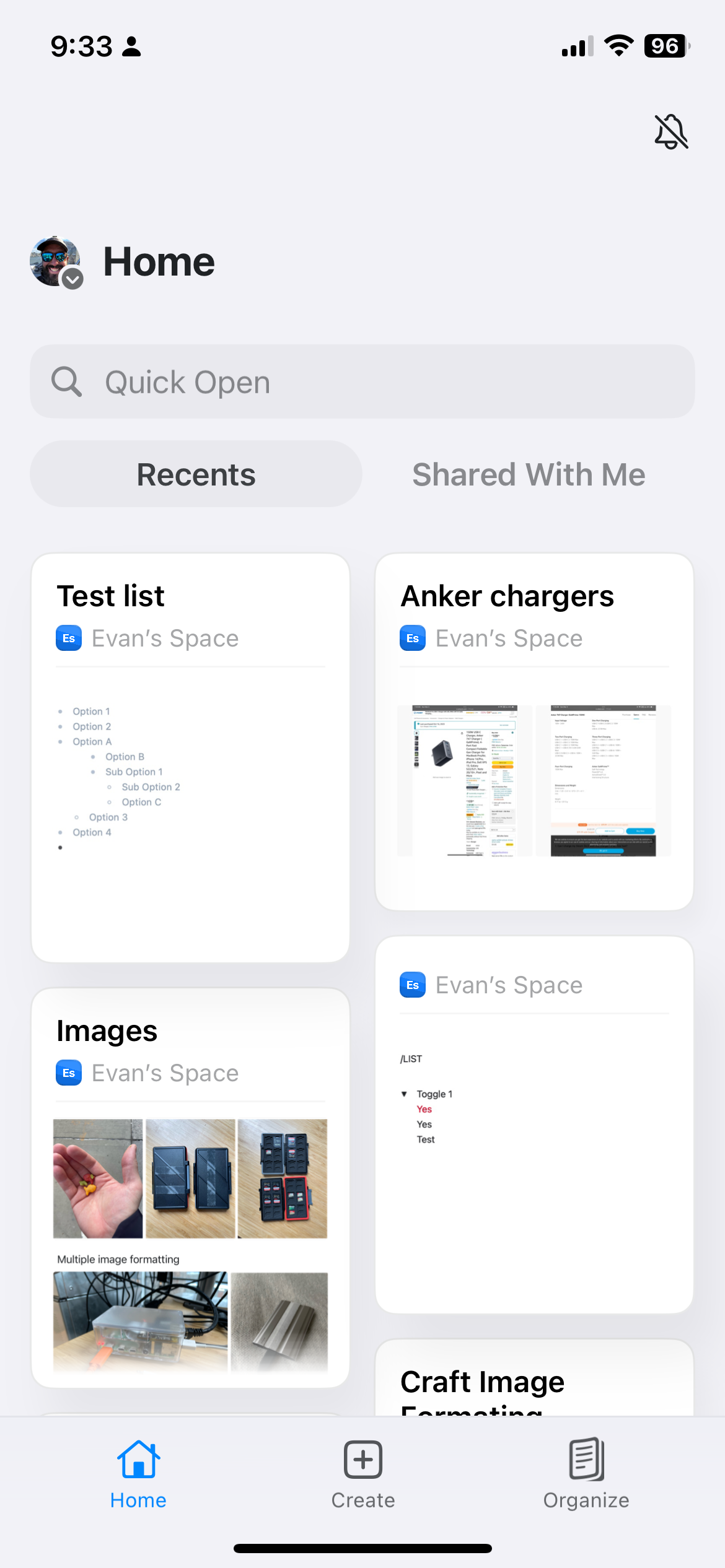
They re-organized the app into “home”, “create”, and “organize”. Ultimately, my folder structure is where I spend 100% of my time, but now it’s buried in the last section? In the desktop app the folder structure isn’t persistent, and it keeps disappearing. I now spend a lot of time, looking for the folder structure that contains all my content. Even after using the new version of the app for weeks, I still get lost navigating because the UI is trying to do so much. On top of all of that, the new home folder is front and center combines spaces, which makes no sense since I have a space for work and space for my personal life, and these two things never mix.
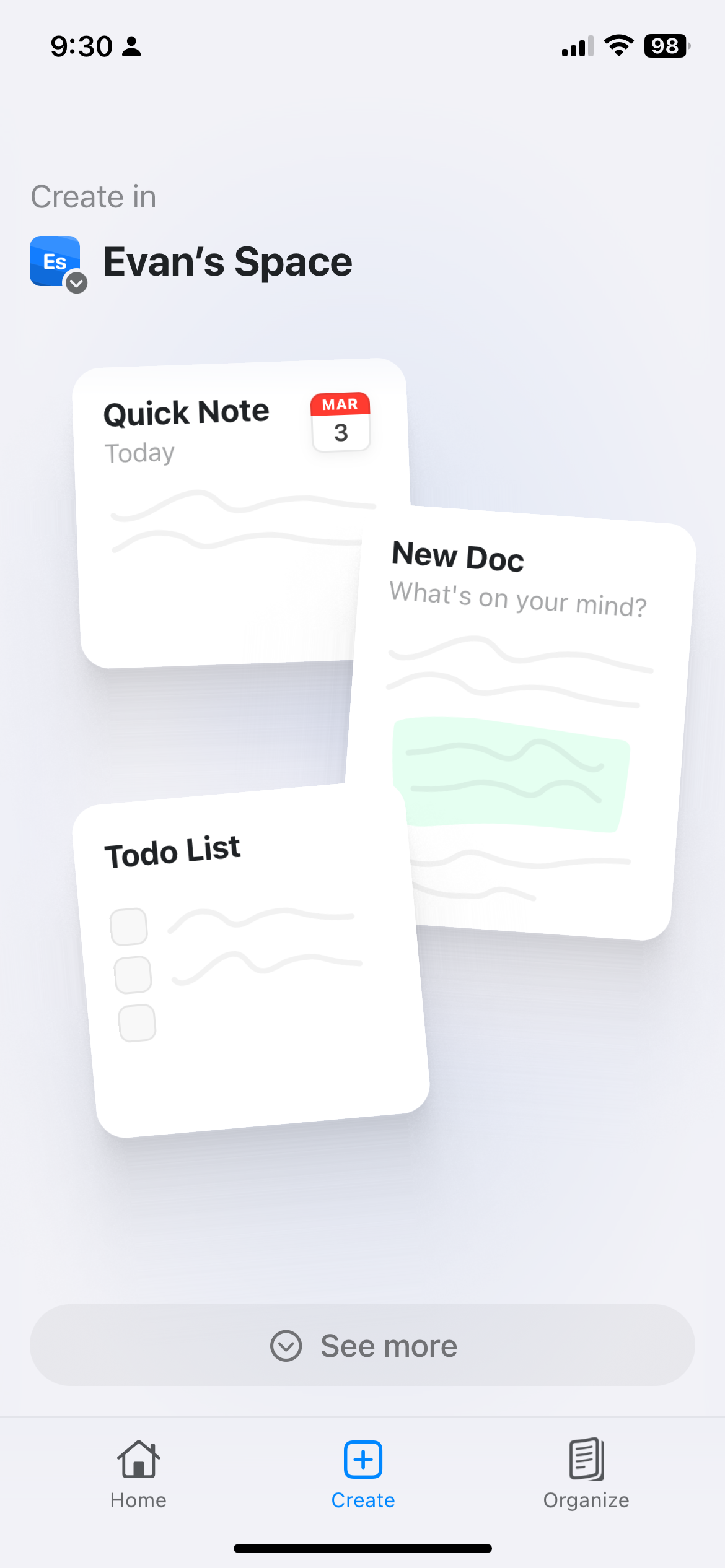
Last but not least, the “create” page mixes navigation UI with button UI. A big create button in the middle of the screen should be a button that creates content. Instead it takes you to some strange landing page that then lets you create different content types. I click this thing a half dozen times a day and it doesn’t do what I expect it to do, it's super frustrating, and it's the prime focus of the new iPhone app.
Overall it’s sad to see an app that had really unique , elegant and useful features slowly get burdened with many new features that should not have made the cut. It also makes me a bit concerned about their long term viability. They’ve recently raised venture funding, and this makes me even more nervous that the drive for outsized returns is making them desperate to believe there’s a bigger market of users out there for these features that don’t make sense.
In subsequent posts I’ll talk more about the notes / document creation space and where Craft could have a viable product, if they’re able to focus.